Can I start to sing Christmas carols yet? Hello! I'm here to share with you the September Kit in our 12 Kits of Christmas group I'm so honored to be in. This month Kara sent out some sweet shabby items! Check out Kara's blog at KandRDesigns!! You won't be disappointed!
September Kit
{photo courtesy of Sharron!}
For my first card, I focused on the wonderful word dies (which I don't have but will soon!). I have been going for a simpler look to my cards lately and this one is no exception! I think this card is one of my favorites so far that I've made for the 12 Kits! That background paper is just so subtle without making it too busy when adding in my few goodies from the kit!
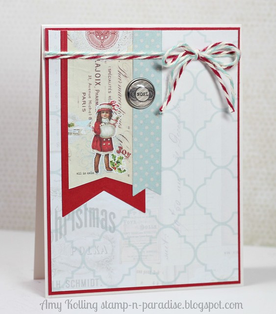
My second card may be familiar to you......I used this layout on a previous 12 Kits card and it's become one of my favorites to use when working with pattern papers! Again, going with a simple look, I think the banners add just the right touch!! That awesome brad was included in the kit too!
What did you think? Kara sure knew what she was doing when she came up with this kit as I LOVED it! Thank you Kara! Now, there is lots more inspiration to go see.....check out the list below for the rest of the group! See you next month!
Kara {KandRDesigns}--September hostess


Love both of your cards. That last one is such a great layout, and way to highlight beautiful patterned papers.
ReplyDeleteAmy, both of your cards are just beautiful...I love all of the bling added to your merry card and that bow, so stunning! That brad on your second card is just so perfect with that sweet little girl, so vintage looking and beautiful!
ReplyDeleteBoth of your cards are so gorgeous Amy. I love the bow you tied on the first one--perfectly puffed and the brad on your second card is placed perfectly, it is so cool!
ReplyDeleteI agree Amy, those banners are the perfect way to use patterned paper on a CAS card! Both cards are beautiful, but the second is drop dead gorgeous!
ReplyDeleteThese are both gorgeous cards! Love them.
ReplyDeleteI'm so glad you enjoyed this month's kit!! I love your first card, but you know how I feel about that second one! I definitely recognoze the design and I'll probably CASE it AGAIN!!!
ReplyDeleteI love the perfectly place rhinestones on the first card, and the font for "Christmas", the big red bow ties is all together! And on the second, I love how you let the papers shine by creating your own banners! I love the double twine bow, too :)
ReplyDeleteYour cards are just gorgeous, Amy! LOVE your CAS designs!! Your bow is so pretty and I adore the banners. The brad and double twine are such perfect elements. I'm definitely going to CASE them both!!
ReplyDeletewow totally gorgeous...
ReplyDeleteYour group ROCKS! I especially like your Merry card!
ReplyDeleteGorgeous!!!! I love the simplicity of both cards. Very elegant, as well. Love the banner one!
ReplyDeleteFabulous CAS cards! Love the first one especially - I reckon you could whip a few of those out in no time! ;D
ReplyDeleteHugs!
x
Such pretty cards!! I love the big ribbon bow on the first one!!
ReplyDeleteWhoa....super cute cards Amy. I love the first one with the Wonderful Words, yes, you HAVE to get them! I remember the layout from the second card and it looks just as great with these patterned papers as the original did. Great job with Kara's kit.
ReplyDeleteLove them both!!
ReplyDeleteThe red just "pops" right off the page...
and the banners!!
I still love that banner card...
I think it's one of my all time favorites and this one will join it! :)
Love both of these, Amy! I love all the 'words' PTI puts out...so disappointed that they were out of the Fall ones last time I ordered! Love the way you've incorporated this one, and love everything about your pretty design on the second card!
ReplyDeleteSo pretty Amy! Looks like Kara picked a cool mix of modern and vintage elements and your cards balanced them perfectly!
ReplyDeleteHope you have a great week dearie!
Amy - beautiful cards!! Love that big bow on the first - and how all the red just pops off the page. On the second I am captivated by the pp with the vintage girl, the button and the two colors of twine. You really let the images shine! SO much impact vs. the eye wandering at lots of different elements.
ReplyDeleteI love how you use patterned paper and still keep your designs clean and simple. The first one is my favorite, but I love the way you used the banners, too. I will have to CASE this design with some of my leftover papers!
ReplyDeleteAmy! Utterly fantastic! You amaze me! I love them both - you've showcased the papers beautifully!
ReplyDeleteLove how you used the kit! Gorgeous cards (as always!!!)! You always inspire me with every creation! thanks!!! :)
ReplyDelete